Bun Bun Bake Shop
Paper Prototyping | High-Fidelity Prototyping | Transition into Working Website
| Project Type: | Individual |
|---|---|
| Role: | Front-end Developer, UX Designer |
| Class: | Programmable Usable Interfaces (Spring 2020) |
| Skills/Methods Used: | Adobe Illustrator, Figma, Invision, HTML/CSS, Javascript |
Link to interactive website: Website | Github
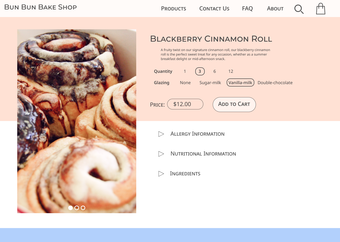
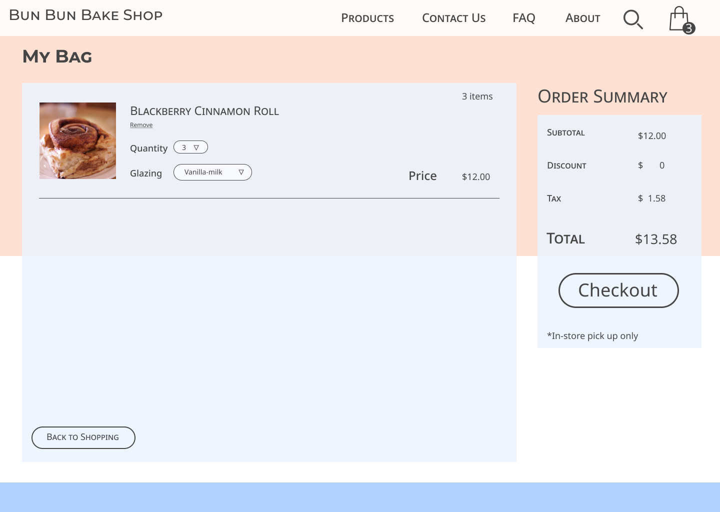
The goal of this project was to create a browsing and shopping website for Bun Bun Bake Shop, a fictional cinnamon bun bakery shop. In terms of my own personal goals of creating this website, I wanted it to be simple and easy to navigate and have a modern visual aesthetic appeal. After creating the initial low and high-fidelity prototypes, I coded this website using HTML/CSS and Javascript to give it various functionalities: purchasing a blackberry cinnamon bun, selecting quantity and glazing, and adding/removing it to/from the cart.
Paper Prototyping
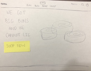
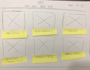
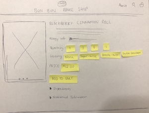
Using paper, pen and sticky notes, I first created an interactive low fidelity paper prototype for my website. I kept the navigation relatively simple, and I wanted the images/illustrations as well as the captions to speak for themselves. Using this paper prototype, I tested the interactivity of the website with a few participants in order to make sure that all the icons, buttons, and images were intuitive to use.
High-Fidelity Prototype
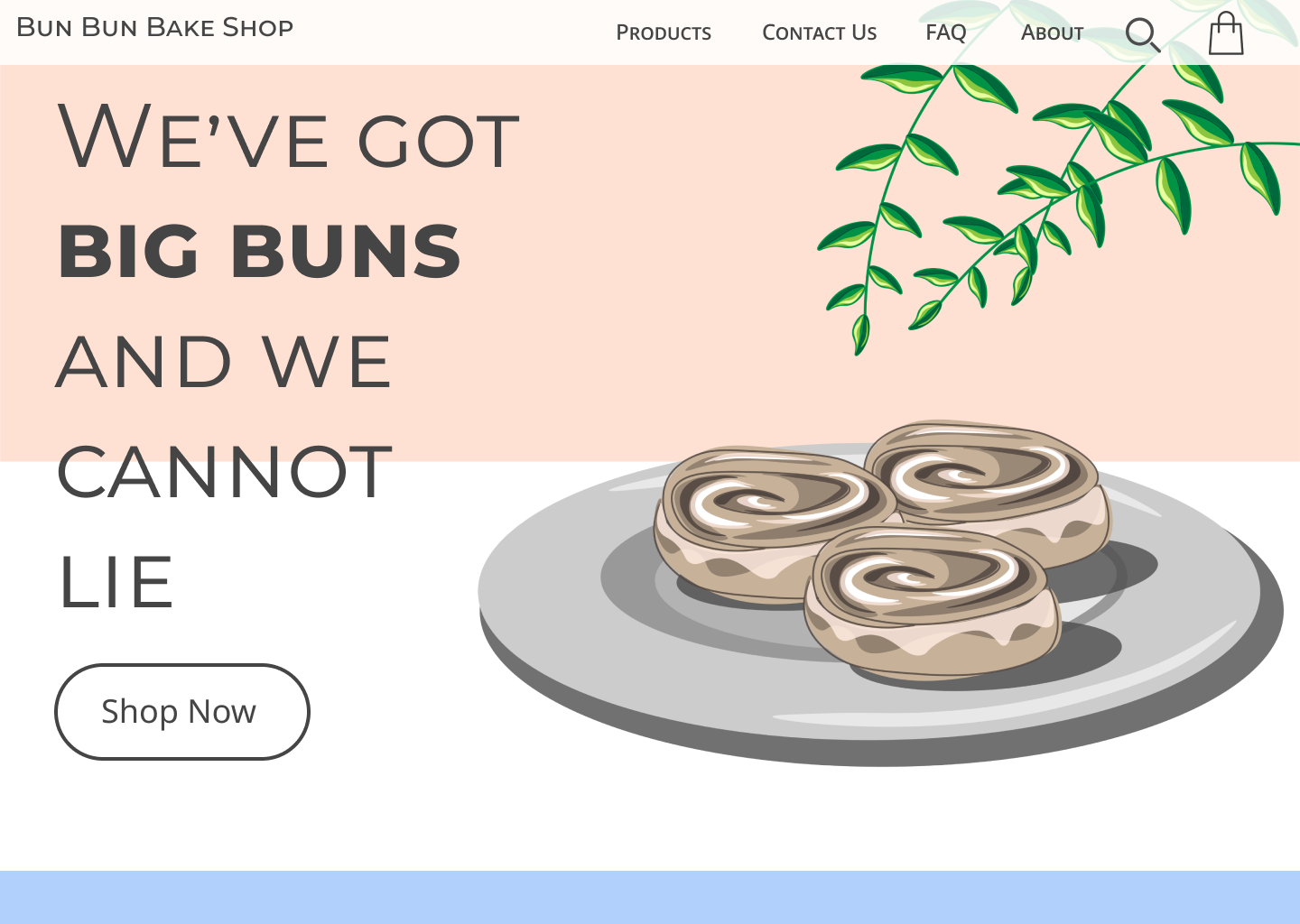
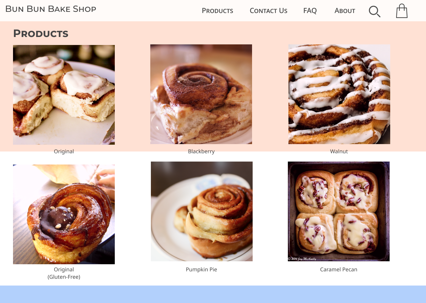
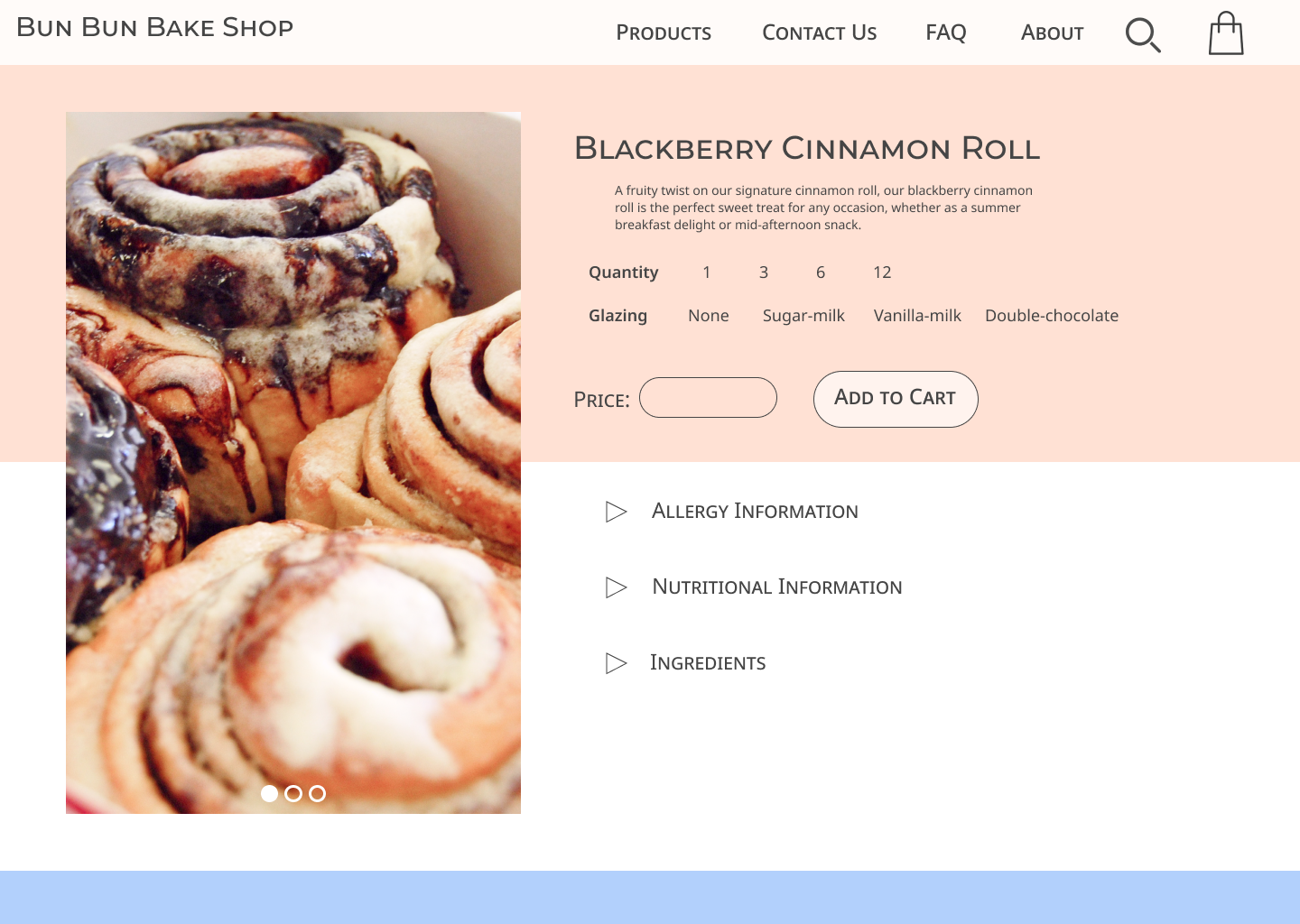
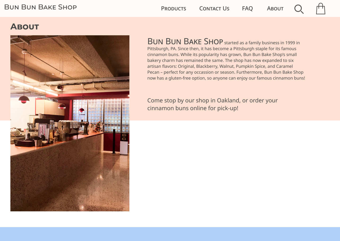
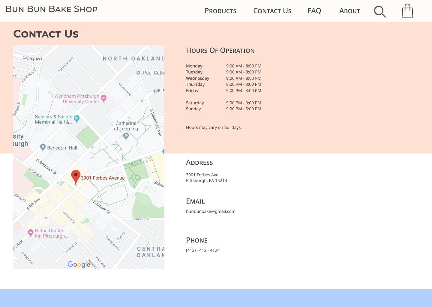
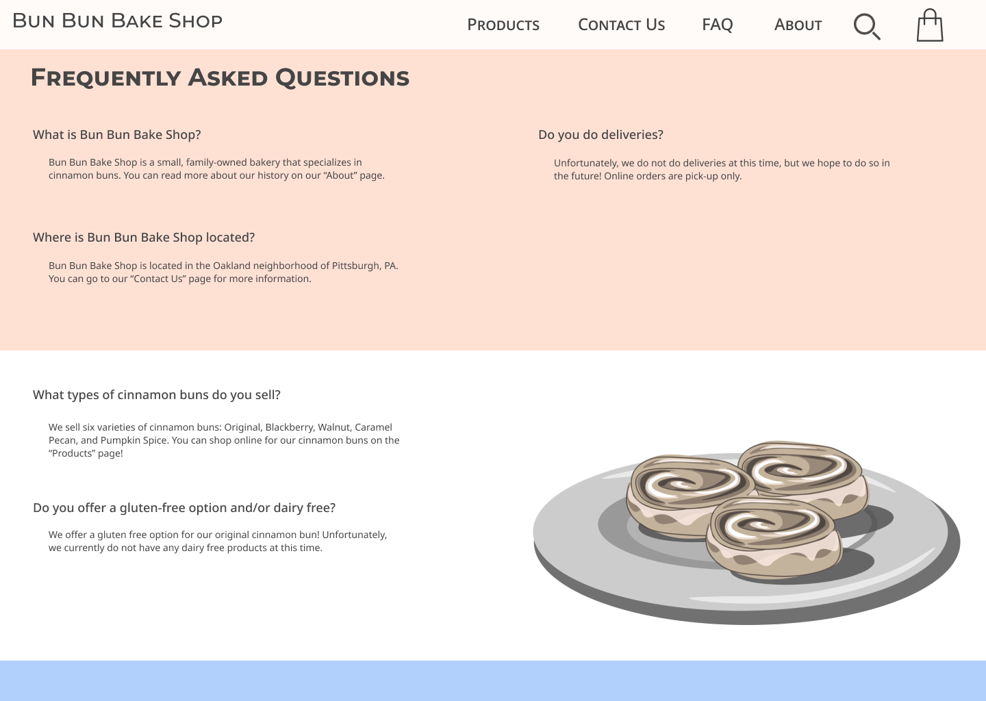
[see slideshow at top of page for hi-fi prototype images]
Link to clickable prototype: Invision
When designing for Bun Bun Bake Shop’s website, I had three main design goals.
The first goal was to develop an ease of interaction between different pages of the website, thus making it simple for users to find important information in different screens. This involves making action buttons look clickable (rounding the edges of buttons and using common symbols to indicate action), as well as gridding and organizing information on the page to suit flexibility of use and user control.
The second goal was to create visual aesthetic appeal in order to entice website visitors to buy Bun Bun Bake Shop’s products. The slogan “We’ve got big buns and cannot lie” was created as a cheeky, memorable phrase for users, and the use of a consistent font and color scheme made the entire website look uniform in nature. A pastel color tone and cute graphics were also used to make the website look soft, friendly, and welcoming.
The last goal was to create visual prioritization to important action items on the screen. This could lead to an increase in the bakery’s online presence and allow potential customers to order buns online and learn more about the bake shop. Certain buttons, such as “Shop Now”, “Add to Cart”, and “Checkout”, were made larger and placed above the fold in order to encourage users to click on them.
When considering the color scheme and branding of the website, I wanted to go for a modern feel, but with a quirky, cute vibe. I choose pastel colors, namely pink and blue (along with use of white and off-black) in order to evoke this feeling of friendliness. With the use of graphics I drew on Illustrator, as well as the slogan “We’ve got big buns and we cannot lie” on the homepage, I wanted to give personality to the website and make the shop more relatable and casual to the customer. The rest of the pages of the website followed a common grid structure and color scheme to make the entire website give off a bubbly personality. I also choose to use two sans serif fonts, with most headings in small caps or all caps, to further enforce the modern nature of the website.
The main reason I chose this branding personality for Bun Bun Bake Shop was because I felt that the name of the bakery was cute sounding and wanted to lean into that by using pastel colors. In addition, I wanted the website to feel clean and modern in order to appeal to a younger audience and feel aesthetically comfortable for the eyes.
Transition into a Working Website
Link to interactive website: Website | Github
This was my first ever website that I’ve coded from scratch with HTML/CSS and Javascript, thus there were a lot of challenges that I faced during the entire process. Specifically, the Javascript portion of the project was the most challenging, as I had never used Javascript before this project. Generally, I made some minor adjustments to the design of the website in order to smoothen the overall coding process. The first challenge I faced was creating the drop down menu for the Blackberry Cinnamon Bun products page, which was easily overcome after fiddling with different CSS properties.
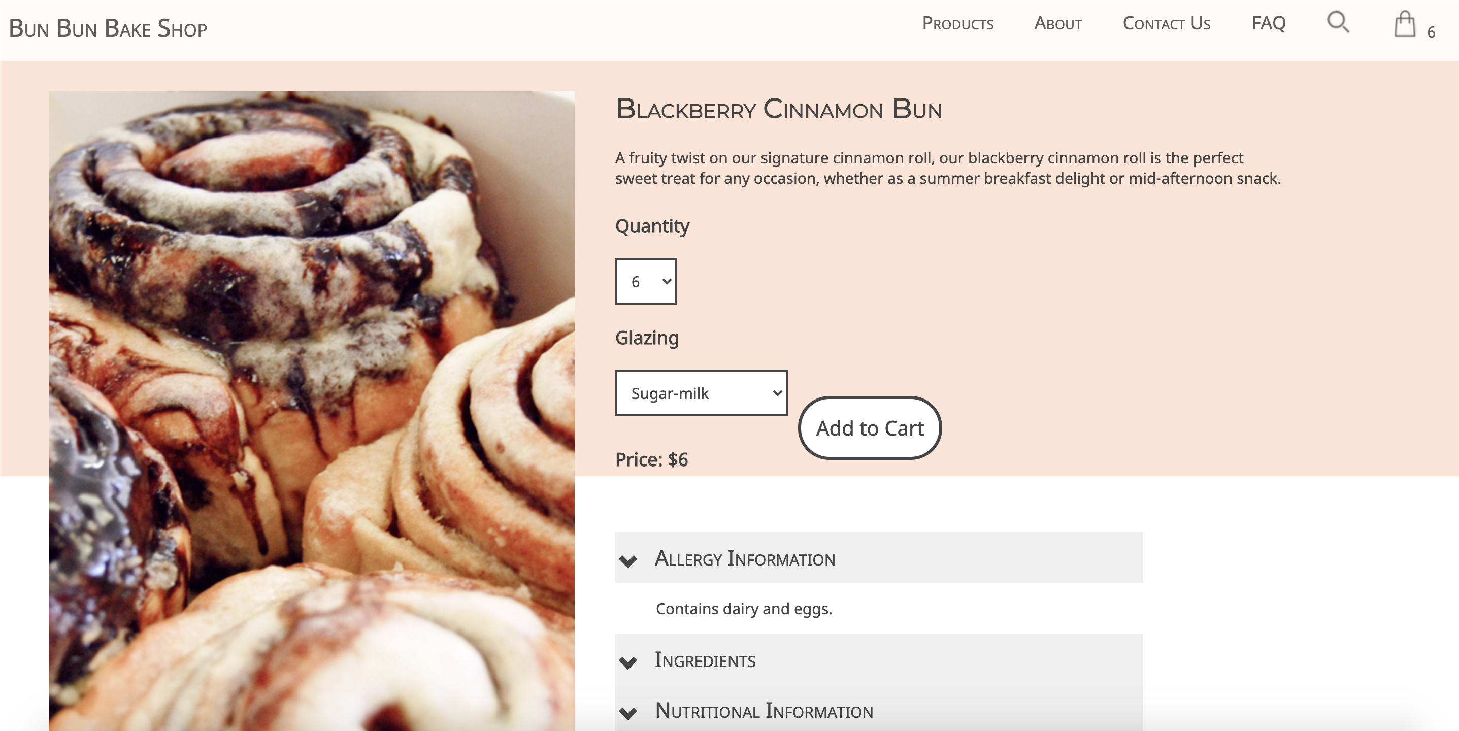
Next, while I was implementing the functionality of the shopping cart, I faced many obstacles and a steep learning curve. One of the bugs that I faced was that the bag quantity in the top right corner would change when I would move through different pages. I resolved this bug by storing that quantity number and incorporating it in my onload functions. In addition, while I was developing the “remove” button in the shopping cart, there was a point where only the cart item would disappear when I pressed the “remove” button, but the Order Summary and bag item quantity amounts would remain unless I refreshed the entire page. I resolved this bug by resetting each id that controlled each of these components to an empty string while also deleting the storage.
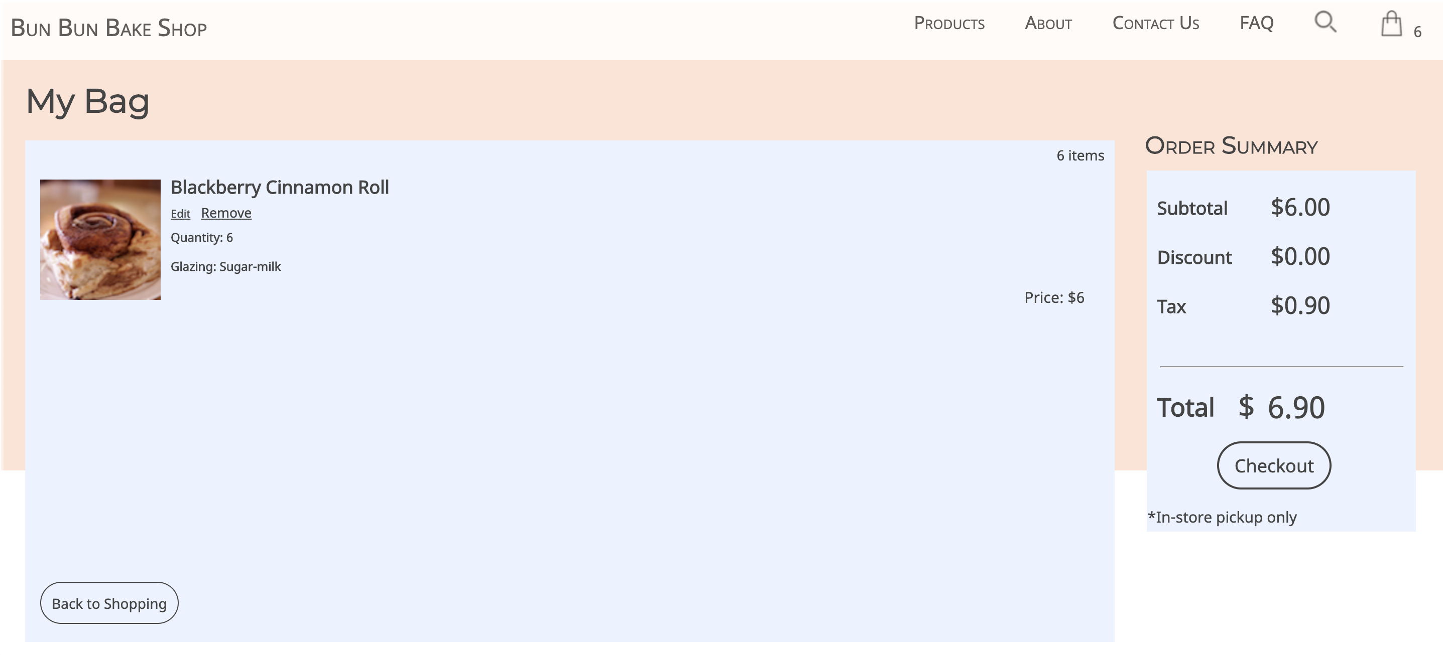
This project was a great learning experience for me – as I have more extensive experience with designing websites, but had little experience with coding my own until this project. Specifically, this project gave me a more in-depth learning experience of Javascript, where I had to apply many novel concepts for the first time. Looking back, I’m proud of how far this project has come, from the early stages of paper prototyping, to wireframing, to a website.
< Back to Projects
